Charting Method Note-Taking: How to Do It in 5 Steps

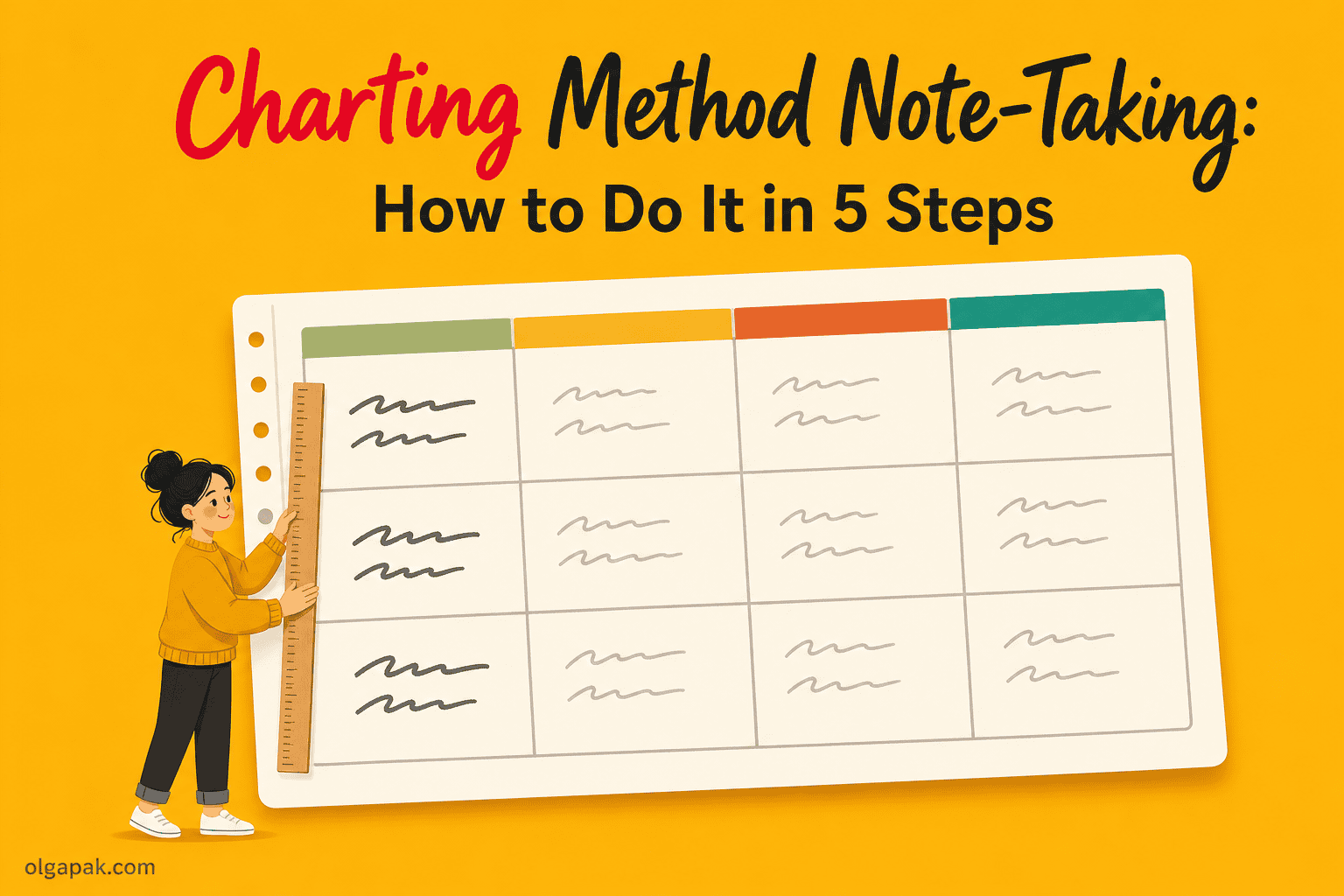
You have probably seen the charting method listed as one of the four classic note-taking methods, right next to Cornell and mind mapping, and then never actually tried it. Charting method note-taking is just this: your page becomes a table, with a labeled column for every category and one row per topic.
I write about productivity systems for a living and build small AI tools on the side, so I have spent a lot of time trying to make note-taking survive a real week rather than just look good in a photo.
Charting is the least-loved of the four, which is a shame, because when the material genuinely is comparable, nothing else lays it out as clearly. If you are still weighing your options, I have the four main note-taking methods compared side by side.
This guide covers what the charting method is, when it works and when it backfires, the five steps I use to set one up, a full worked example you can copy, and the mistakes that turn a good chart into an unusable one.
What the Charting Method Actually Is
Take a blank page, turn it sideways, and rule it into three to five columns. Each column gets a label, one category of information. Each row is one topic, and every cell holds the fact where the two meet.
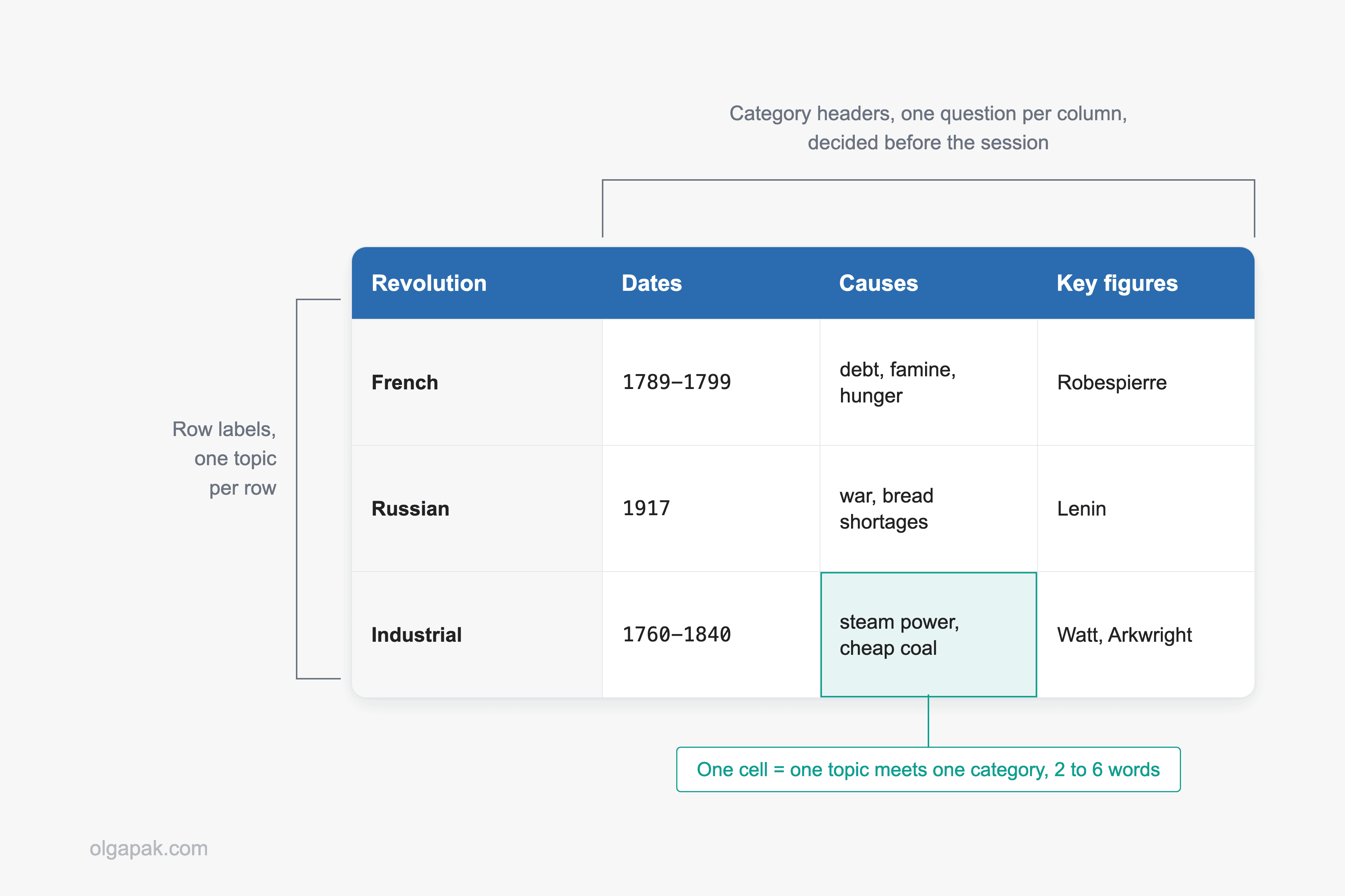
You will also see the same thing called grid notes or the matrix method. Both names describe one page: a grid where the columns are the questions you are asking, and the rows are the things you are asking about.
Here is the smallest useful version, taken from a project meeting:
| Decision | Owner | Deadline |
|---|---|---|
| Move the launch to March | Priya | Friday |
| Park the pricing page redesign | me | end of month |
Two rows, three columns, and you can already see who owes what. The University of York’s study guide describes the method as working particularly well for subjects with clear, structured information, and as ideal for comparing facts, statistics, or different concepts.
So where does the real effort go? Not into the format. The discipline is entirely in choosing the columns.
When the Charting Method Wins
Charting has one requirement, and it is strict: the material has to be comparable. The same kinds of facts, repeated across several things, in a shape you can predict beforehand.
That covers more of your week than you would expect:
- Historical periods, compared across dates, causes, key figures and outcomes
- Competing theories or frameworks, measured against the same handful of attributes
- Drugs or conditions in a health-science class, each with an onset, cause and treatment
- Product comparisons, where you weigh four options against four criteria
- Meetings, where each item resolves into a decision, an owner and a date
One college study-skills guide puts the trigger neatly: reach for charting when your test will focus on facts and relationships, when the course content is heavy and delivered quickly, and when you want an overview of your entire course in one spot. That last one is the sleeper benefit: a whole term collapses into two or three sheets.
The University of Tennessee at Chattanooga’s note-taking guide makes the structural point: if the lecture format is distinct (such as chronological), you may set up your paper by drawing columns and labeling appropriate headings in a table.
Meetings are the version of this you will use outside a classroom. A recurring agenda is predictable by definition, which is the only condition the method has.
When Charting Flops
Charting fails in one recognizable way: a beautiful empty grid, and a speaker who refuses to cooperate.
One note-taking guide lists the avoid cases better than most. Skip charting when:
- The speaker jumps randomly between ideas
- You are brainstorming or working an idea out from scratch
- The material needs diagrams, equations or heavy visuals
- You do not know the structure ahead of time
The University of York adds the subject-level version of the same warning: a text-based grid is harder to work with for STEM subjects that require visual representations like graphs or formulas. A narrow cell is a terrible container for a derivation.
Narrative and argumentative material is the other bad fit, and it is the one people misjudge most often. An argument does not have columns. It has a claim, evidence, an objection and a reply, stacked in an order that matters, which is a hierarchy and belongs in the outline method instead.
Now the part I want to be straight with you about. Several popular guides state that the charting method improves memory and retention.
I went looking for the research behind that line while writing this, and there isn’t any: every guide making the claim cites nothing at all, and I could not find a single study on charting specifically. So I am not going to repeat it.
What charting reliably gives you is structural. Comparison becomes visible, and revision gets faster, because the answer to “how did these three actually differ?” is one row you read across instead of six pages you have to reread.
How to Use the Charting Method in 5 Steps
Five steps, in the order I actually do them. The first one carries most of the weight.
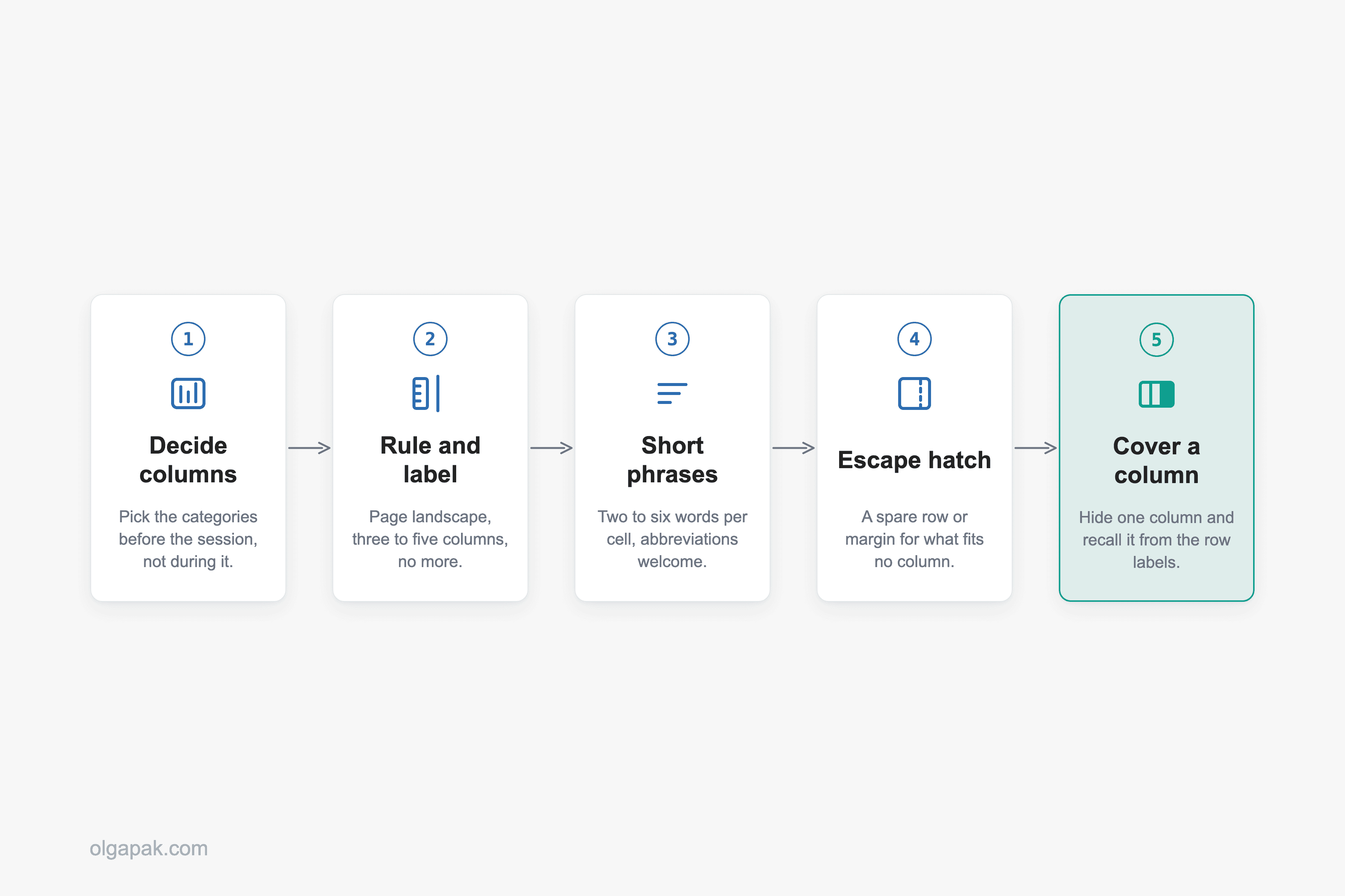
Step 1: Decide Your Columns Before the Session, Not During It
This is the step beginners skip, and skipping it is the reason their charts fall apart. As one beginner’s guide to the method puts it, charting is not a method that lets you take notes as you go: analyzing your materials beforehand is an important part of the prep work.
Do it the night before, or the moment the reading lands in your inbox. Your categories are usually sitting in plain sight already, in the lecture title, the slide deck, or the chapter subheadings.
Step 2: Rule the Columns and Label Them
Three to five columns, and no more. Past five, your cells get too narrow to write anything in.
Turn the page landscape. Label the leftmost column with whatever the row is (the topic, the case, the theory), then give every remaining column exactly one attribute. A ruler helps, and a dot-grid or squared page helps more.
Step 3: Fill Rows With Short Phrases, Not Sentences
Two to six words per cell. Abbreviations are fine, arrows are fine, symbols are fine.
“Don’t worry about writing detailed sentences. Short phrases work better,” as one note-taking guide sums it up, and that single instruction is what keeps a chart readable a month later.
Step 4: Leave an Escape Hatch
This one is my own addition, born from the chart I ruined by wedging one homeless fact sideways across three cells: leave a spare row along the bottom, or a two-finger margin down the right-hand side, for anything that fits none of your columns.
Something always fits none of them. Without a place to put it, one stray tangent breaks the whole grid.
Step 5: Review by Covering a Column
Cover one column with your hand and try to recall its cells from the row labels alone. Then uncover it and check.
That turns the chart from a document you reread into a test you sit. A systematic review of study techniques in health-professions courses found that retrieval practice outperformed restudying across the comparisons it covered. One r/NoteTaking poster described the underlying trap for note-taking in general: “The problem isn’t effort. It’s that passive note-taking creates the illusion of learning. You feel productive but nothing sticks.”
A Worked Example, Start to Finish
Say you are a first-year psychology or social-science student meeting research methods for the first time. Three keep coming up, and the exam is going to ask you to compare them, so the categories choose themselves: what each one is, how many people it involves, what it is good at, and where it falls down.
| Method | What it is | Sample size | What it is good at | Main limitation |
|---|---|---|---|---|
| Survey | Same questions, asked to a sample | Large; breadth is the point | Attitudes and behavior, big groups | Self-reported; correlation, not cause |
| Experiment | Change one variable, measure another | Smaller, split into groups | Testing cause and effect | Lab conditions unlike real life |
| Case study | Deep look at one case | One case, or a handful | Rich detail, rare situations | Does not generalize beyond the case |
So what does the finished grid show you? Read down the sample-size column and something surfaces that no paragraph would have handed you: sample size is not a quality score, it is a consequence of what each method is for. Read across the experiment row and the trade-off sits right there in the open, since you buy causal certainty with realism.
Two details did not survive the squeeze: an experiment assigns its participants to conditions at random, and a survey can run as a questionnaire or as an interview. Both of those belong in the margin, not in a cell.
That is the whole value of the format. Three tidy paragraphs would have carried exactly the same information and buried both of those insights mid-paragraph.
Paper vs. Digital: Which One to Chart On
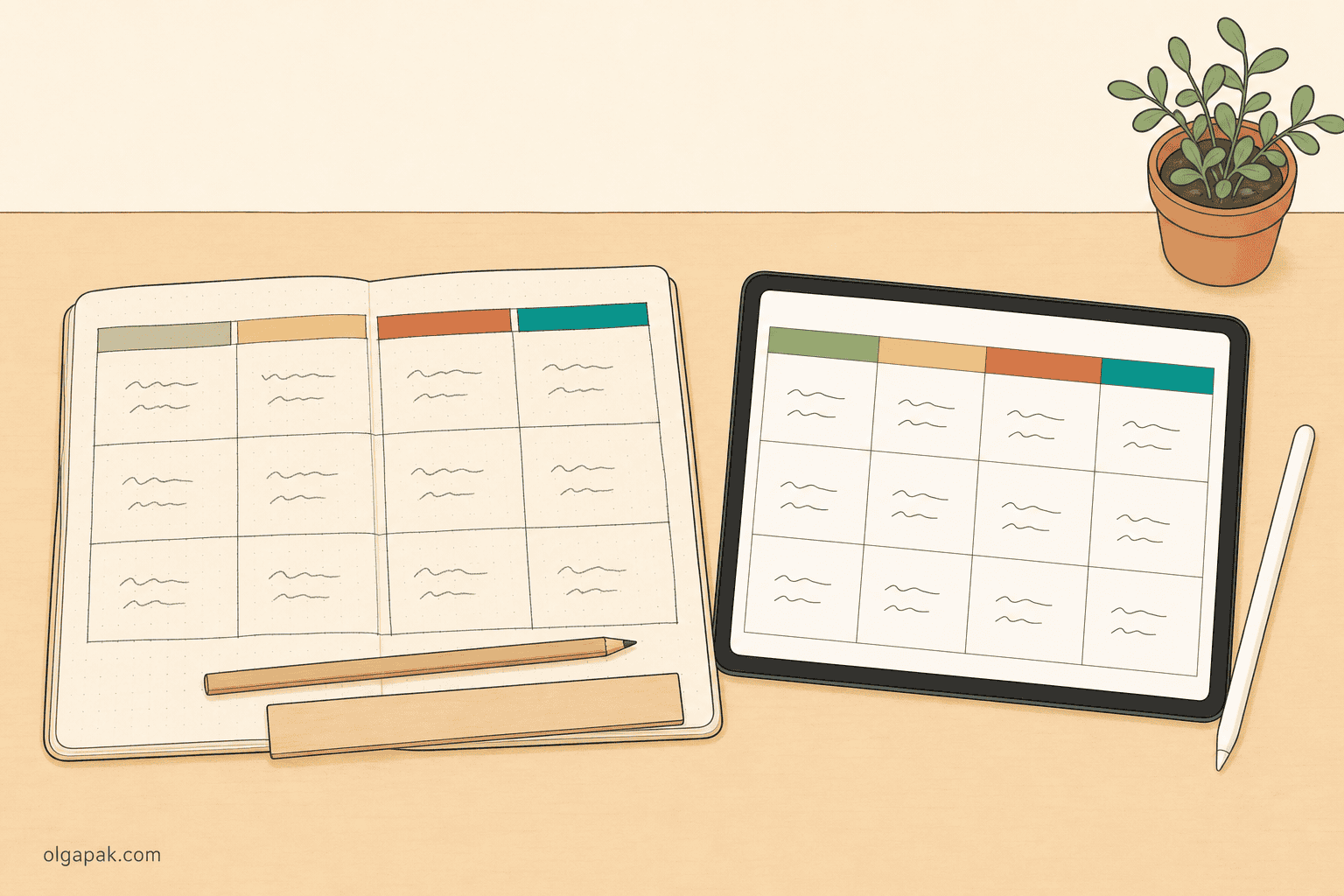
Do you ever start a chart in a notes app and spend the session rearranging columns instead of listening? Paper wins more often than I expected, because ruling columns by hand forces you to commit to your categories up front.
So which should you actually pick?
Digital wins when you cannot predict how many rows you will need, when you want to reorder or search later, or when the chart has to live where your team can see it. A table in whatever notes app you own is fine. A spreadsheet is fine. No new app required.
Someone will tell you handwriting beats screens for recall. The evidence is less tidy than that: in a small study of 68 medical students who took notes by hand, on a tablet, or on a laptop, recall scores showed no significant difference. For charting specifically, the difference I notice is more mundane: you cannot quietly redraw a column you already ruled in ink.
The tablet middle ground is real. A nursing student’s charting-method notes, hand-written into a pre-made table on a tablet, were shared publicly by a note-taking app account, which tells you the format travels off paper perfectly well.
On paper, the page matters more than the pen: grid or dot-grid pages turn ruling columns into a five-second job, which is one reason I fuss about the best notebooks for note-taking.
Five Mistakes That Ruin a Chart
Every bad chart I have made failed in one of five ways, and I have made all five. Ouch. Most of them were decided before the session even started, which was a humbling thing to notice.
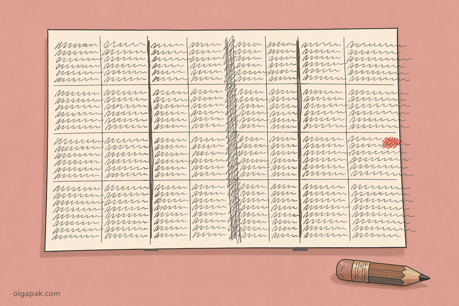
- Choosing your columns mid-lecture. You end up redrawing the grid at minute twelve while the lecturer moves on without you. If you could not name the categories beforehand, this was never a charting session.
- Writing full sentences in the cells. The chart stops being scannable and becomes a badly formatted essay. Short phrases, every time.
- Too many columns. Eight columns on one page gives you eight strips too narrow to write in. Three to five, and the rest goes in the margin.
- Charting material that does not chart. One beginner’s guide goes further and rules out live lectures altogether, along with equation-based material such as math. I would put the line in a slightly different place: a lecture you can predict, and prep columns for, charts fine; a rambling seminar does not.
- Building the chart and never opening it again. This is the expensive one, and it is a note-taking problem long before it is a charting problem. As one person on r/NoteTaking described their own systems: “I have spent way too much time trying to make complex systems like Notion work, only to realize the maintenance of the app was taking more effort than the actual note taking.” A chart you never cover a column of is just tidy stationery.
How Charting Fits Next to Cornell, Outlining and Mind Mapping
So where does charting actually sit among the four?
Here is the one-paragraph version, since the full four-way comparison belongs in the pillar guide I linked at the top. Reach for the Cornell note-taking method when you cannot predict the session and need cues and a summary you can quiz yourself on afterwards. Reach for outlining when the material has a hierarchy or an argument. Reach for the mind mapping note-taking method when you are connecting ideas or brainstorming, and the shape is a web rather than a list. Reach for charting when several things share the same set of attributes and you need to compare them.
Charting is easily the least-discussed of the four in the places students actually argue about note-taking, and I think that is a gap rather than a verdict. It is a narrow tool that is very good inside its lane.
Start With One Chart This Week
The hard part of charting is never the ruling. It is deciding what the columns should be, and that gets much easier once the source material is short enough to see all at once.
When I am charting a long chapter or a dense PDF, I condense it first with the Text Summarizer, then read the summary hunting for the categories that keep repeating. Try my free AI tools to automate the mundane, and spend your energy on the columns instead of the reading.
FAQ
What is the charting method of note-taking?
The charting method means splitting your page into labeled columns, one per category, and giving each topic its own row, so every fact lands in the cell where its topic and its category meet. You will also see it called grid notes or the matrix method. All three names describe the same page: a table you build first and fill in second.
When should you not use the charting method?
Skip charting whenever you cannot predict the structure of what is coming: speakers who jump between ideas, brainstorming sessions where the shape emerges as you go, material built on equations or diagrams, and narrative or argumentative content where the order of the ideas is the point. In those cases you spend the session redrawing your grid instead of listening.
Is the charting method better than the Cornell method?
Neither is better in general, because they solve different problems. Charting compares several things across a fixed set of attributes you know in advance; Cornell captures a live session and reviews it afterwards using cues and a summary. If you cannot predict how the session will unfold, Cornell is the safer default.
Can you use the charting method for meetings?
Yes, and it is one of the strongest non-academic uses of the method. Columns for decision, owner, deadline and blocker turn a recurring meeting into something you can scan a week later, which prose notes rarely manage. The condition is the same as in a lecture: the meeting needs a predictable agenda, so a weekly stand-up works and a freewheeling strategy session does not.
Does the charting method improve memory?
I could not find a single study supporting a memory benefit specific to charting, and the popular guides claiming one cite nothing at all, so treat that claim as unproven. The gains you can count on are structural: comparisons become visible at a glance, and revision gets faster because the answer is a row rather than a page. The review step, covering a column and recalling its contents, is what does the actual work.